
XM Cloud – From Data to Display: Mastering Field Types for Seamless Backend-to-Frontend Integration – Part 2
I am pretty sure you are curious about all the different field types, how they are supported and how they look like after reading Part 1 of this blog post series, right? For all the people, who
I am pretty sure you are curious about all the different field types, how they are supported and how they look like after reading Part 1 of this blog post series, right?
For all the people, who landed here without reading part 1, I would highly recommend to read that one first as it settles the scene and gives some valuable basic understanding.
Without any further words we directly jump into an overview of all the supported field types.
Field Types
Let us start with a comprehensive overview of what field types currently exist out there you can choose from. In general those are divided by 3 categories
- Simple Fields
- Link Fields
- List Fields
Those pretty much give you an idea, what you can add to your template for the editor to add and maintain content. Within the following chapters I will deep dive into all of those categories including in depth examples of all the different field types possible.
Simple Fields
And we will start with the so called Simple Fields. Simple fields are more or less all the field types where you add textual content or media. Of course there are some more advanced simple fields we will examine in more detail.
- Single Line Text
- Multiline Text
- Rich Text
- Image
- File
- Date
- Datetime
- Integer
- Number
- Checkbox
Link Fields
Link fields in comparison to simple field types are more for linking your current content element to something else. This can be some internal reference to another item, so we can consume its content in your content element. Typical example here is a News Article, which links to an Author element. Of course there are dozens of more cases. But not only that, with the General Link type you can also create any kind of clickable link element like internal or external URL, email or phone, which all have dedicated html representation. (See more about this here https://www.w3schools.com/tags/tag_a.asp)
- General Link
- Drop Link
- Drop List (Special Case)
List Fields
Last but not least we have List Fields left. Those pretty much let you add one or multiple reference(s) to other content elements. This is very similar to the previously mentioned Link Field type Drop Link and Drop Tree with the only difference, that per design, you can choose multiple other elements as reference. Typical example could be a Hero Slider, which references multiple slide elements. Or a page, which links to multiple tag elements.
- Checklist
- Multilist
- Treelist
- Taglist
One special thing on those list field types is, that basically the first three are doing the same under the hood and safe the data the same way. The only real difference is the representation in the UI and therefore how an editor interacts with them. But you will see this in more detail in a later in this post.
Persona
I guess you now expected to have a full list of all the field types with all the little explanations. But let us do it a bit differently now, as I would like to show this more from a user / persona point of view. This reflects more the holistic view on all the field and field types among all the different persona.
The following persona, which I will describe in more detail later are the following
- Admin
- Marketer
- Developer
I will highlight for those individually, what they can do and how they work with all the field types. Of course in the end these are just roles. It could also be that admin and developer are one person in reality, where in other projects those are splitted among two different physical people. In the end this does not really matter and can be done as wished.
Let us deep dive into all of these persona in detail and let us ask ourselves following questions
- What does this persona do in Sitecore?
- How do they achieve this?
- Are there any special things to mention or to know when it comes to special field types?
Admin
With that said, we directly start with the first persona, the Admin. An admin usually works in the Sitecore backend to prepare everything. Of course an Admin has lots of to dos. But because we are focusing here on fields and field types, we will only highlight the work on those.
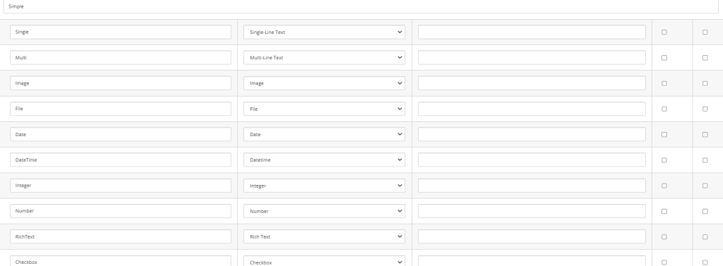
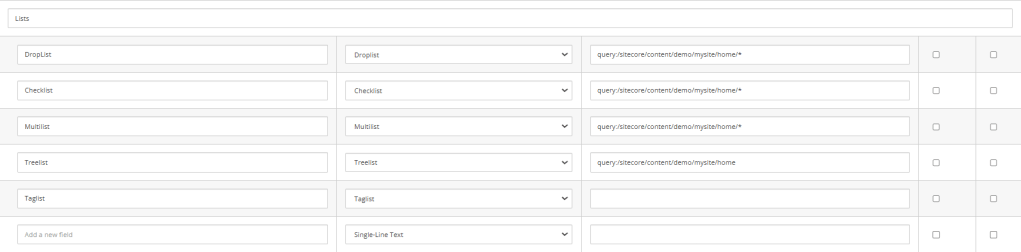
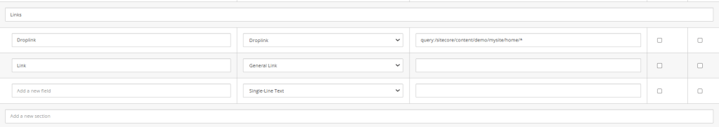
The example above is a full example of all currently fully supported field types in XM Cloud when it comes to Page Builder. You can see that the simple field types just need a name and the type and usually not additional setting in Datasource.. The more complex ones like lists or links usually need an additional setting under Datasource. This can be used to determine the root of the list field for instance. Read more about this here https://doc.sitecore.com/xmc/en/developers/xm-cloud/controlling-the-list-of-items-in-a-selection-field.html#root-item or https://doc.sitecore.com/xmc/en/developers/xm-cloud/configure-the-multilist-with-search-field.html.
Let me additionally highlight the possibility to combine those with predefined tokens.
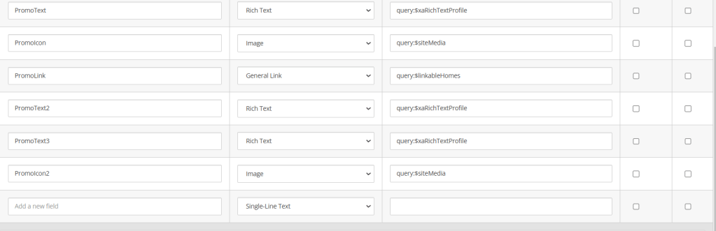
As you can see from the standard Promo example there are quite a few of those tokens to even better and more generically control the behavior of different fields. See more details about those here https://doc.sitecore.com/xmc/en/developers/xm-cloud/recommendations–extending-sxa.html#limit-scope-of-fields-linking-to-items.
When it comes to the pure work of field configuration on a template, that’s all what needs to be done. Of course usually the whole component creation cycle involves some more tasks around this specific one. You can read more about this here https://developers.sitecore.com/learn/accelerate/xm-cloud/implementation/developer-experience/creating-new-components or if you want to see the whole creation live and in action you can see this video from Sebastian Winter and me where we described and demonstrated it in detail https://www.youtube.com/watch?v=nAKJ4MaIong (Min 23:00).
Developer
Let us have a look at my favorite role the Developer, more specifically the head application developer. Now that we have seen how to create a template with all the various fields, we would need to understand, what we need to do, so that everything is
- displayed correctly
- Marketers can easily manage the content
AS a developer it is crucial to understand
- how to correctly map the returning JSON to my components model
- how to render / display the data so that all the great inline editing capabilities are there if possible
Let us start with the first part, the data modeling. Basically it is very simple as the components structure is always the same.
Properties like
- uid
- componentName
- datasource
- params
- fields
are always there and can easily be mapped in our head application.
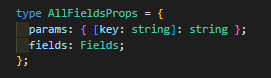
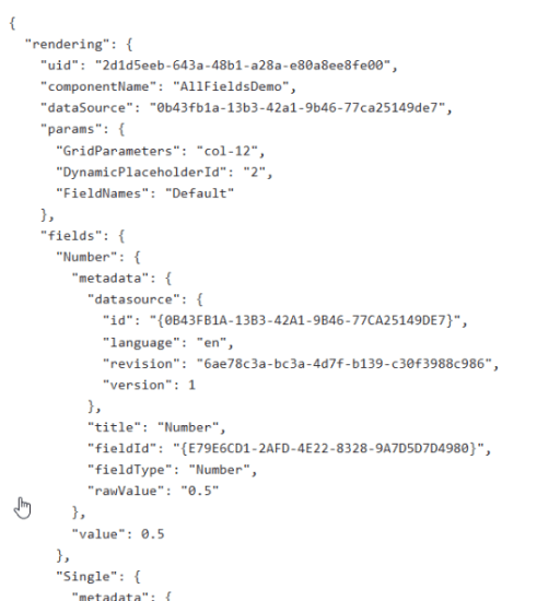
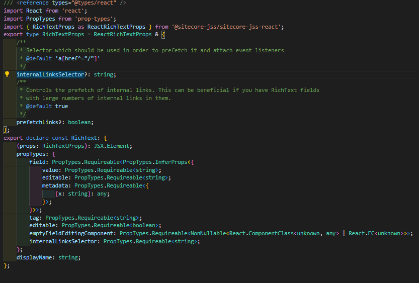
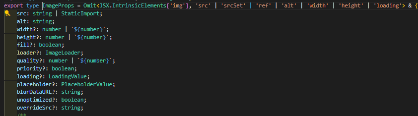
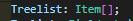
The screen above shows a pretty common example to extract params and fields. If needed we could also map the rest of the fields. You can see, that you can strongly type everything as possible. For instance the params is nothing more than a simple dictionary of string values. So we can really map it to something similar in Next.JS like [key: string] : string. Same goes for fields. This one is a list of different fields represented as complex object. This object is the Fields type, which holds all the needed fields.
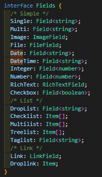
Above is the full Fields interface holding all the different fields with proper data modeling. We will cover the more special ones in a sec. Again, in essence we just tell next.js how our model looks like. To be able to do so, we can again either way have a look at the JSON response OR we already know the type of the field, cause we spoke with the Admin and agreed on a “contract”, how the component and the fields should look like. In JSS we have different helper, so that we do not have to setup those complex models on our own.
Field<T>: The first and simplest helper is the generic Field helper. This one represents a basic data model of a field, which is returned from the backend.
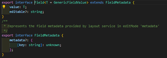
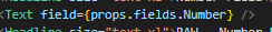
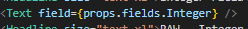
All the standard fields like Single Line, Multi Line, Number, Integer, Date and Datetime and even Checkbox are using this generic Field helper, cause all of these fields store the information in exactly the same way. The only difference is the date of the actual value.
- Field<string>
- Field<boolean>
- Field<number>
These are the commonly used specific types for the various support fields. Usually when using this helper you also use a very specific Render Helper the <Text field={…} /> render helper


You might have noticed that two fields are not mentioned here. First the Checkbox field. The reason is, that we cannot use this Render Helper to render a checkbox. The reason for that is also pretty simple as it would need to render “1” or “0” (The usual representation of a checkbox raw value). But you might ask yourself, why isn’t there a Checkbox render helper? Good question. The answer is, because the type checkbox is commonly used to control stuff behind the scenes. A checkbox is never used in a typical WYSIWYG editing context. Therefore we also do not offer any render helper to support this. To access the checkbox in code we simply grab the Boolean value from the data model and use it 😉
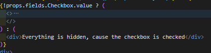
I know, maybe a stupid example, but usually its use cases like this, where we typically use a Checkbox
RichTextField: The next render helper is specifically for Rich Text Fields as it brings in some more special functionality.

But first we see, how we can use this helper. In essence its exactly the same, just with some more options. What options you have? Let us have a closer look into the field implementation.
So you can see beside the standard stuff we can control empty rendering behavior if links are prefetched the used surrounding tag and even more.
ImageField: The next special field is the Image Render Helper specifically Next Image Field Render Helper. It comes with all the great options the standard NextImage component brings in just abstracted to be used within JSS. See below an example with some more added attributes
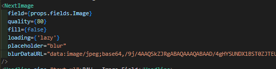
This specific setting for instance gives us the possibility to display some placeholder image in case the loading time of the real image takes to long for some reason. In addition it reduces automatically the quality a bit to save bandwidth. (Something around 80% quality usually is the best trade off between saving bandwidth vs. not seeing any negative impact)
And this is just a subset of what is possible. See even more options below.
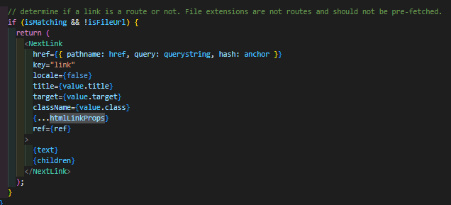
LinkField: This leads us to the next very important render helper for rendering all kind of General Link fields.

This Field helper is very helpful in being able to render all the different possibilities a general link from Sitecore can have. You don’t have to care about anything and don’t have to write all the different switch case or if else statements to deal with that somehow on your own 😉 The output if everything is right is a full blown next link with all the given properties and settings
FileField: Last but not least the File render helper. To be honest this one is the one I never used, cause I never had any use case :-D. Doesn’t mean it is not useful. So let us try it out.

You will see it does not offer any further properties to add.
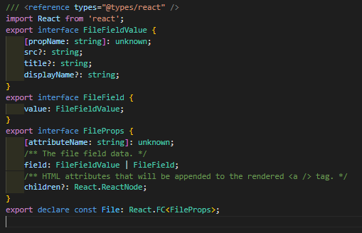
And in the end it helps us to generate the Anchor with a proper text based on the linked file.
Auto mapped: Last but not least we have a look at a pretty cool special case. Namingly all the list based field types or fields which hold an item id. You might think now, that you have to grab the Item ID, make additional calls to Edge to grab additional data? But no, you don’t need! Sitecore already has a mechanism to map those IDs or list of IDs to underlying models. This means you can build your head application model mapping the same way. Let us examine how such a JSON model looks like
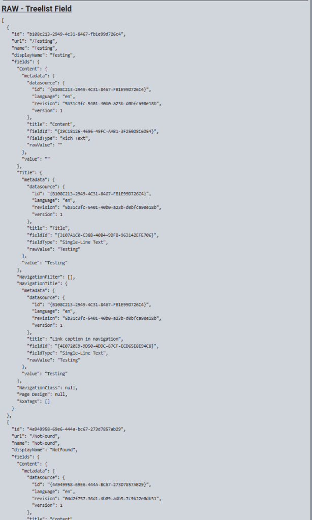
Note: In case it is a Dropdown you would have just one entry rather than a list.
We can now easily map this Treelist field to a custom model with the help of existing models / or custom models if you want.
You see, that it perfectly matches the given data model. And from that point we can now easily start using those data. Usually you would not inline edit the data in WYSIWYG as it is nearly the same as with checkbox. The actual Item id you would choose and set is not of interest for the component itself. This is just the entry point of grabbing additional data behind the scenes to be displayed on the page. Usually things like Slider / Banner / Lists etc. are handled like this.
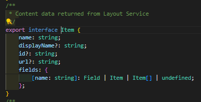
Below is an example of, how you could easily use those data even together with inline editing capabilities.
Basically we can easily iterate via map through all of the entries. And because each entry is a standard item, and use the standard item model, we can also access the fields of those to be used in our already known Rendering Helper.
See above an example how this looks like for the Treelist example but works exactly the same for all the reference based field types.
Marketer
Last but not least I would like to highlight the work of a Marketer a bit. Cause as soon as the admin created the template and the fields and the developer provided some head application implementation, the component is ready to be used by the Marketer. The biggest question now is
How does the Marketer manage Content in XM Cloud, nowadays?
And this is a pretty good and valid question. The answer is pretty simple. The Marketer should only use the Page Builder. If you don’t know the Page Builder so far, please stop and take a second to familiarize yourself with it as it is a crucial instrument in XM Cloud for content management. https://doc.sitecore.com/xmc/en/users/xm-cloud/working-with-the-page-builder.html
For the rest, very well done, you did your homework! 😀 Joke beside, let us then continue with having a look into Page Builder and it’s options. As you already know by now, there are two different ways a Marketer can manage content in Page Builder
- Inline Editing
- Context View
And those both are really powerful especially in combination. I would like to start with an overview how inline editing looks like and works from a Marketers point of view. But before doing this, here is a full list of inline editable fields
- Single Line Text
- Multiline Text
- Rich Text
- Integer
- Number
- Image
- Date
- Datetime
- General Link
All of these fields can be managed by simply clicking into the components onto the specific field / text. Even though there are also difference of what actually happens. With the following field types an editor can click onto a field and can start writing some text.
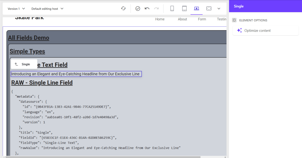
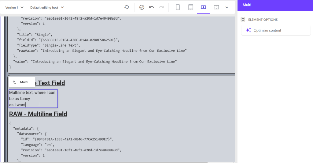
- Single Line Text
- Multiline Text
- (Rich Text)
Single Line Text / Multi Line Text: Those are pretty simple and strait forward to use. Here you can see, how this usually looks like for some examples
With the rest of the fields it is a bit more complicated cause of the nature of the fields. If an editor clicks on those fields you see a new context menu pops up on the right hand side with additional options. You can change all kind of additional data there, which are immediately saved and reflected in the UI.
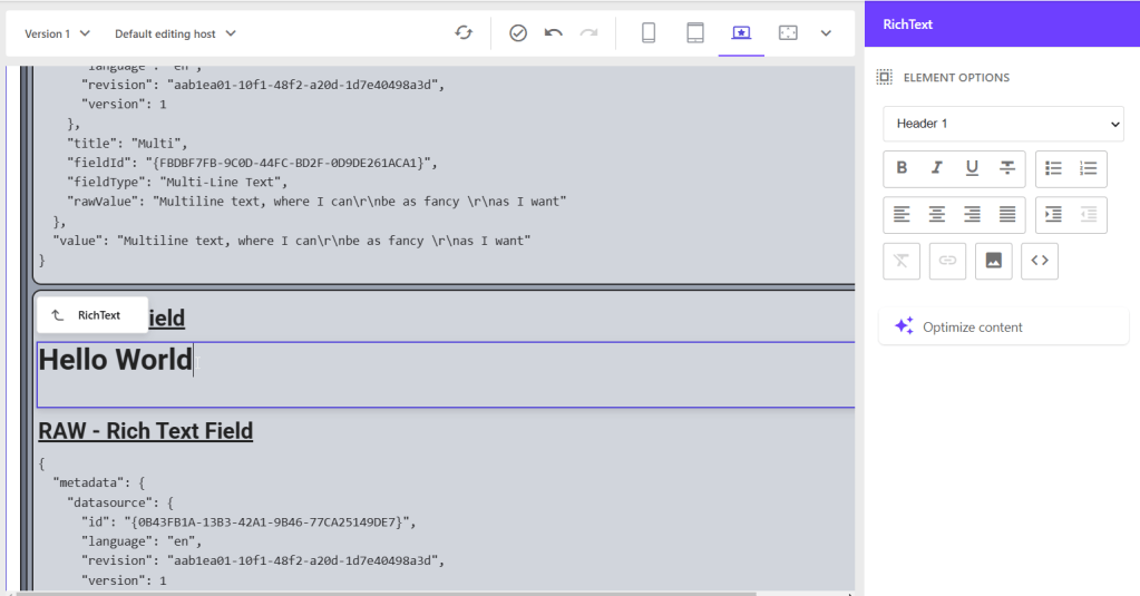
Rich Text: Starting with the Rich Text field you CAN just click into the field and start typing. But the full power is offered e.g. on the right hand side, where you get all kind of additional settings, which are typical for an RTE Field like type of text (Heading, Paragraph etc.) Making things bold / italic etc. and so on…
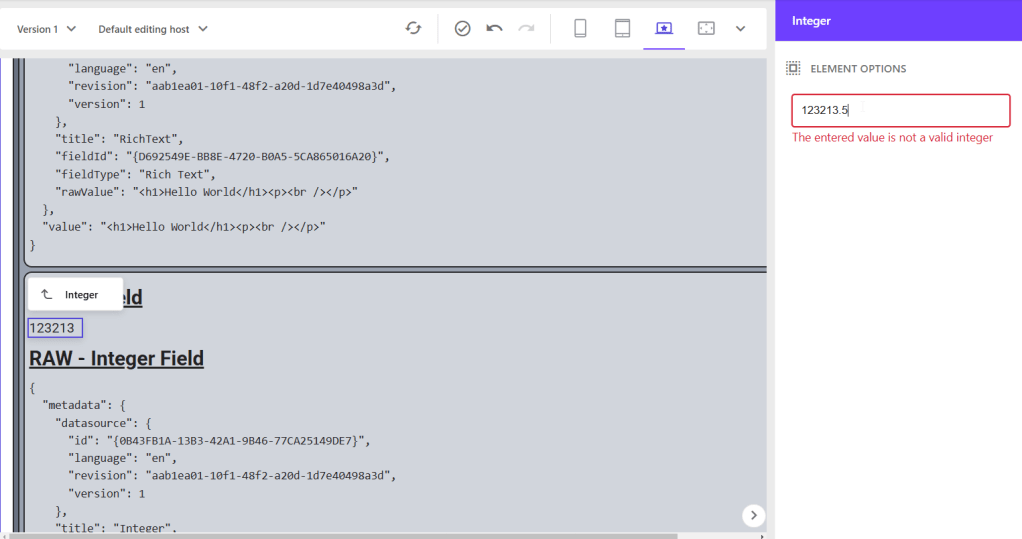
Integer: Integer fields let you click into the field and then manage the text on the right hand side directly. The reason for that is, that this additional input field has built in validation to forbit any non-number input. In case someone enters invalid input you immediate get feedback AND content is NOT autosaved, but reverted after leaving the field.

Number: Number field behaves exactly the same, only the validation is different. It allows floating numbers as well, but still no text 😉
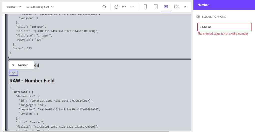
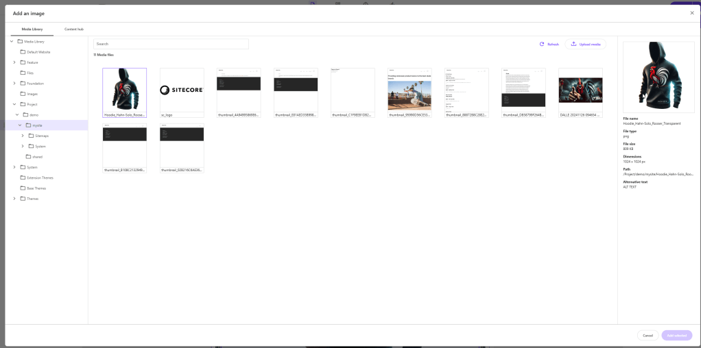
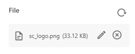
Image: This leads us to the image field. This one is a more complex field as we have to have a mechanism to choose an image including a preview functionality.
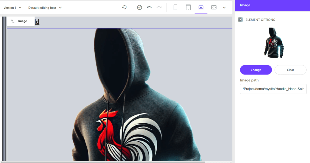
When you click to change the image you get the option to choose from Media Library as well from Content Hub DAM (If configured correctly). In the end the field takes care on saving everything properly via autosave, once you chose a field.
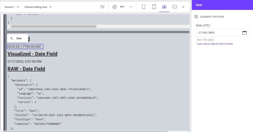
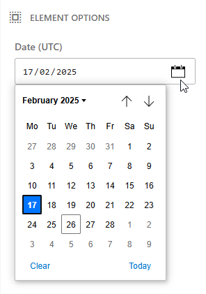
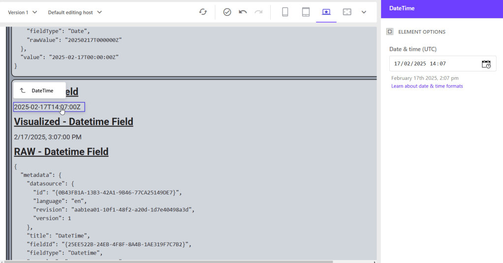
Date / Date Time : Next special case is the date as well the data time field. Those fields store the value of a date / date time in standard ISO format, but represent it in a more Marketer friendly way including a nice calendar view to choose a date / datetime.
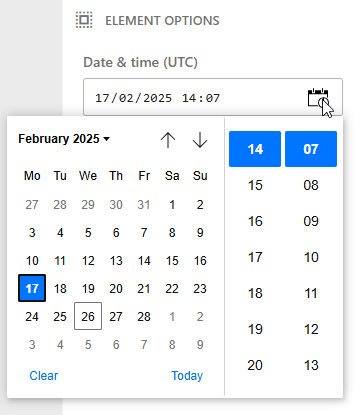
The date time field just adds the output with a nice little time picker and stores this value as well than leaving it 00:00:00 like the date field does.
General Link: Last but not least let us look at a general link field. As we know, the management of this field might be a bit more complicated, cause of all the possibilities you have and all the data you need to fill in. Below you can see, that when clicking on such a field you get a rich editing capabilities offered on the right hand site to manage all the needed data.
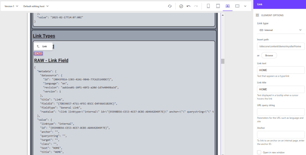
So those fields are basically inline editable but with a provided context menu on the right for additional UI support. You could say it is hybrid inline and context view editable.
Coming now to all the remaining field types, which are not that easily inline editable, not even in this hybrid approach.
- File
- Checkbox
- Drop Link
- Drop List (Special Case)
- Checklist
- Multilist
- Treelist
- Taglist
Luckily we also have a pretty nice solution to manage those fields as well in Page Builder. The new Context View is now your best friend for those fields.
Let us examine in more detail, what these editing capabilities are. Simply click on the component and open the content tab on the right.
File: With that said we start with the File field. This one is pretty similar to the image field with some minor differences. The representation is different in a way that it shows file name, as well as file size, cause in most cases we want to offer this file as download to want to open it in browser to read it or do similar. The dialog to change the file is exactly the same than with Image field as it just targets the Media Library OR Content Hub DAM if configured.
Checkbox: Let us start with the checkbox field. This one is pretty simple as the UI just offers a checkbox to check or uncheck. That’s it, pretty simple but effective now.

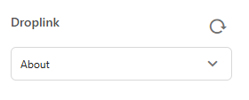
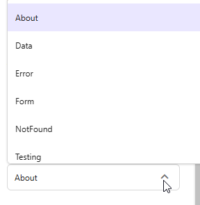
Drop Link / Drop List: Next one is Drop Link / Drop List, which I put together as they seem to behave exactly the same. You can see, it offers a small dropdown to show, which entry is currently chosen. By clicking onto this it offers the expanded flat dropdown options
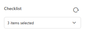
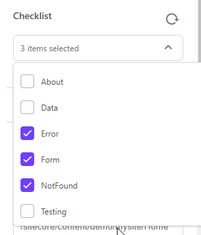
Checklist: This leads us to the Checklist field. This one behaves a bit different. First it shows us the number of selected items, rather than the names. And second by clicking onto the field it offers us a multiselect via checkboxes. Again the items are represented in a flat list.
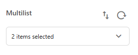
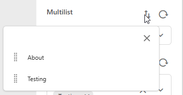
Multilist: Multilist is pretty similar to the Checklist. The only real difference, or better saying additional feature is, that you can easily sort your entries. For this, we have a new button, which opens the list of selected entries together with Drag & Drop capabilities.
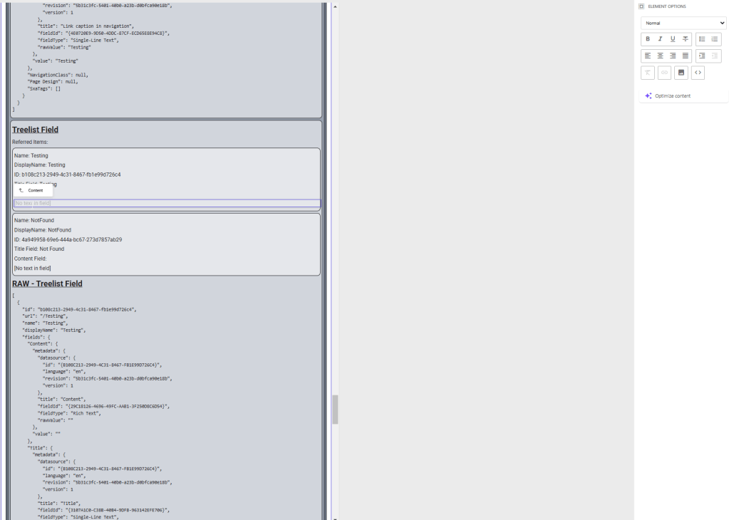
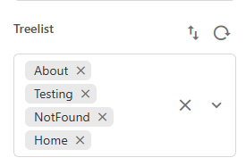
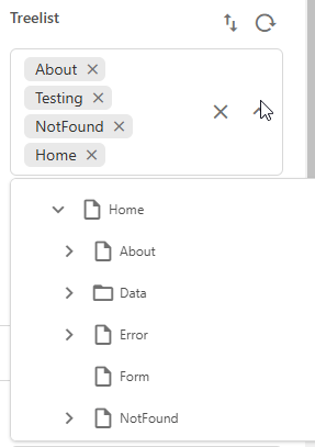
Treelist: Coming to the Treelist. As the name already let us imagine, this behaves different. First it shows us all the selected entries with name. And second by clicking onto the field we get a tree like view on our data to choose from.
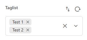
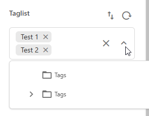
Taglist: Last but not least the tag list. This one is pretty similar to the Treelist and offers same capabilities. The only real difference is, that it always points to the standard SxA Tags, which you can find in the global data folder. (Current Site AND Shared Site)
Conclusion
Finally we come to an end. Let us recap, what you learned today. Within this post we got a comprehensive overview of the field lifecycle from creation by an Admin, how a developer works with fields from Model mapping to markup output and field based special logic, to Marketers and how they are able to manage all the content via inline editing or via new contextual view in WYSIWYG. Just see this as a starting point to better understand all about field types, which exist, how they are used and when.
- ai
- architecture
- nextjs
- sitecore-platform
- xm-cloud